Web
Branding
The Panorama Chlum project was created with the vision of offering high-quality living that sensitively complements the unique landscape of the Bohemian Forest. The main challenge was to differentiate itself from the poor-quality rapid construction in the surrounding area and to create an authentic brand that appeals to a community of people with a connection to nature, sustainability, and modern smart living.


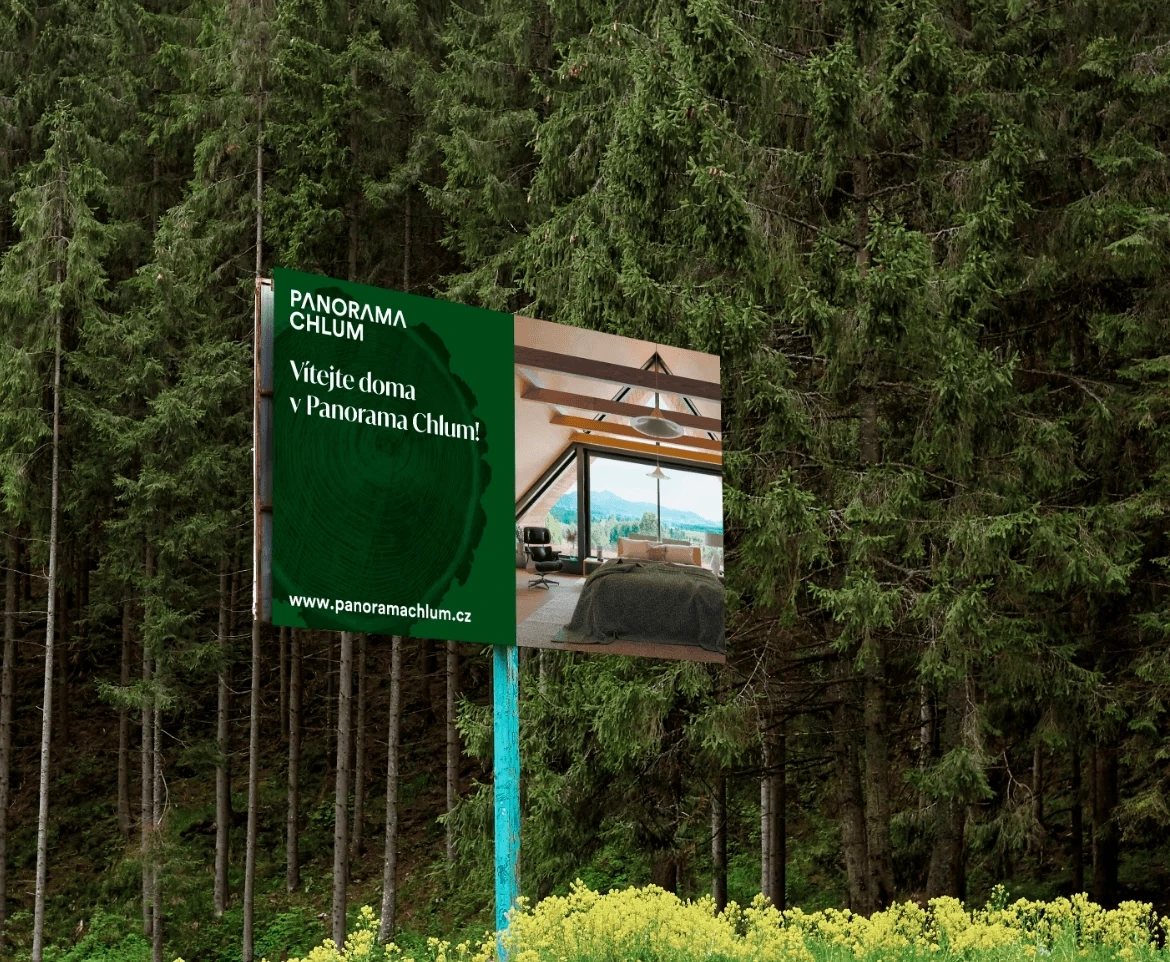
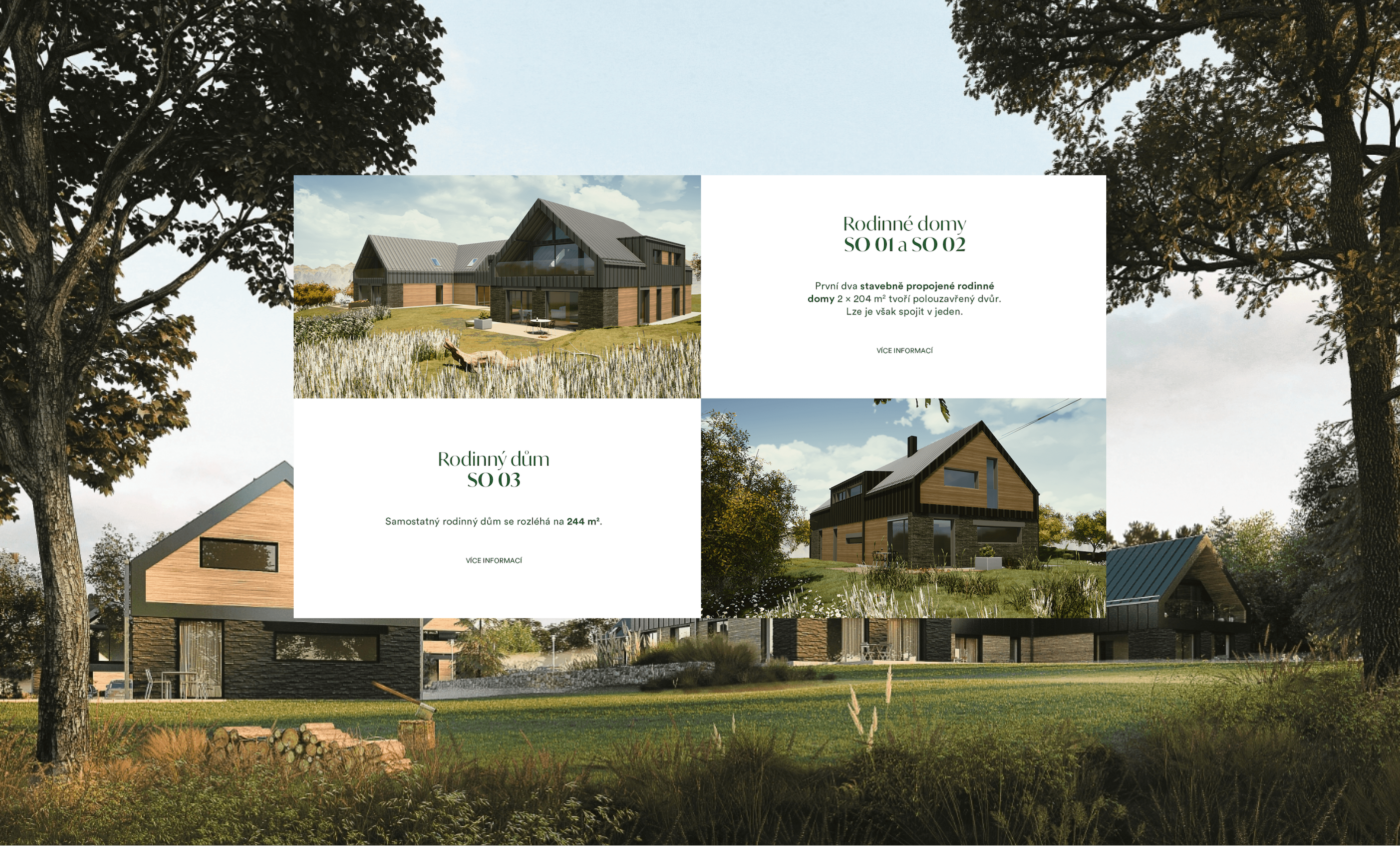
The location where the project is situated was our primary inspiration.
Greenery, trees, wood. The green color as a color of nature, healthy landscapes, energy, activity, but also harmony, balance, and tranquility. In the logo, we replaced the letter A with triangles that refer both to the copse as a wooded hill and to the original folk alpine architecture, from which the architectural design of the buildings conceptually derives (e.g., typical saddle roofs and utilized materials).


Mattoni
At home as in a restaurant, 2024
The first campaign for the one-liter glass bottle of Mattoni, titled "At Home Just Like in a Restaurant," responded to the growing trend of home dining. The goal was to introduce the glass bottle as a symbol of elegance and "fine dining" that can elevate even an ordinary home lunch into an exceptional experience. The campaign leaned on authenticity and light humor, emphasizing that dining culture is not about being bound by etiquette, but about the joy of spending time together at a beautifully set table.

Revoltik
Branding & visual identity
A startup that helps photovoltaic owners earn money from energy surpluses needed to be built from scratch. Name, identity, website, campaign. We took it step by step.
The entire process was preceded by thorough strategic preparation, which ensured that every step – from the name to the advertisements – was backed by clear arguments and defined goals. This strategy relied on an analytical approach to the market and a deep understanding of the target group.
 Download our presentation